
Your Brand Is More Than Your Logo
Brand Strategy · Part 2 of 8
A logo is important.
It gives people a mark to recognise. It creates a point of identification and helps your brand show up consistently across websites, packaging, proposals, social media, signage, and everything in between.
But a logo is not your brand.
Some of the most powerful brands in the world are recognisable before the logo even appears. You know them by their colour, their shape, their tone, the way their products feel in your hand, the way they speak, the way they behave. The logo confirms what you already knew. It does not do the recognising on its own.
That is the difference between having a logo and having a brand.
A logo identifies you. A brand system makes you memorable.
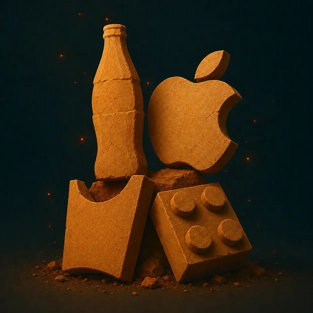
Remove the logo. What is left?
This is one of the simplest tests you can run on a brand.
Strip away the logo from every touchpoint, the website, the packaging, the social posts, the ads, the store, and ask what remains. If the answer is "not much," the brand has been leaning too heavily on a single asset. If the answer is still a long list of recognisable cues, something more substantial has been built.
Take Coca-Cola. Remove the full logo and there is still the red, the contour bottle, the script-like visual language, the nostalgia, the festive associations, the shared table moments. The bottle shape alone is one of the most recognised forms in commercial history, not because it carries a wordmark, but because it has been repeated consistently for over a century until the shape itself became a signal.
Take Apple. Without the logo, there is still the material quality, the white space, the minimal language, the packaging, the store environments, the quiet confidence that runs through everything. The brand has a personality so coherent that it comes through in every surface it touches.
Take Nando's. The logo is almost beside the point. People recognise Nando's through its timing, its humour, its willingness to comment on things other brands walk carefully around. The personality arrives before the mark does.
That is what a genuinely strong brand achieves. Recognition through many signals, not a single symbol.
The logo is only one expression of the brand
Logos tend to be treated as the centre of branding because they are visible, concrete, and easy to point to. They are the first thing asked for and the last thing anyone wants to revisit. They go on business cards, email signatures, pitch decks, and store fronts. That visibility is real, and it matters.
But it can also become a distraction from the more important question.
Not: what should the mark look like? But: what should people recognise, feel, and remember?
A brand is built through a far wider set of cues, colour, typography, layout, photography, illustration, motion, packaging, product design, service experience, sound, tone, behaviour, and the slow accumulation of those things over time. Some cues are visual. Some are verbal. Some are sensory. Some are purely behavioural. Together, they create what you might call the brand's world.
The logo lives inside that world. It does not replace it.
Coca-Cola and the power of many cues
Coca-Cola built its recognition by giving people more ways than one to identify the brand.
The logo is iconic, but the brand's power is distributed across a much wider set of assets — the red, the bottle silhouette, the script style, the delivery fridges, the festive iconography, the association with sharing and celebration, and the sheer repetition of those cues across more than a hundred years and almost every country on earth.
The contour bottle is particularly instructive. It was not designed to be a logo. It was designed to be a bottle. But through consistent use, it became something more, a shape so associated with one brand that it functions as a mark even in silhouette.
That is the compounding logic of brand recognition. One strong asset is useful. Many strong assets, all pointing to the same personality, are something else entirely. They reinforce each other. They give people multiple entry points into the same recognition. If the colour catches your eye before the wordmark does, you are already there.
Apple and the brand that lives in the product
Apple is a useful example because so much of its brand is carried through the experience of the product itself rather than through traditional communication.
Remove the Apple logo and the brand is still unmistakable. The materials, the packaging, the product photography, the store environments, the minimal copy, the interface design, the controlled way it launches things, all of it comes from the same underlying personality: simple, premium, deliberate, and restrained. Everything seems considered. Nothing feels accidental.
This is important because many businesses assume branding happens in marketing. It does not, or not only there. Branding happens wherever people experience the business: in the app, on the website, in the payment flow, in the onboarding email, in the support conversation, in the packaging that lands on someone's doorstep.
Apple understands this deeply. The brand is not declared in advertising. It is expressed in the design of the thing itself. That is why it feels so consistent, even across a product range that has expanded significantly over the decades.
McDonald's and the mark that became architecture
McDonald's offers a different kind of lesson, one about what happens when a brand asset is repeated long enough and widely enough that it transcends its original function.
The golden arches began as a design element. They became something closer to infrastructure. In many parts of the world, you do not need to read the word "McDonald's" to know what you are looking at. The arches do the work from a distance. They have become a visual shorthand, a signal for speed, familiarity, and a very specific kind of comfort.
Alongside the arches, the red and yellow system, the packaging, the restaurant layout, the ordering rhythm, and the consistency of the food itself all contribute to a recognition that goes far beyond any single logo treatment.
A shape becomes a memory. A colour becomes a category cue. A building becomes a signal. A meal becomes a ritual. None of that happens through logo placement alone. It happens through relentless repetition of the same set of cues until people internalise them without trying.
Capitec and the cues you cannot see
Not every brand cue is visual. That is easy to forget in conversations about logos and colour systems.
Capitec is a good South African example of a brand built significantly through simplicity, accessibility, and the quality of its digital experience. But there is something even subtler at work. Many people would struggle to sketch the Capitec logo accurately from memory, yet they know the sound of a successful tap payment. That small sonic moment is part of the brand. It is not the whole thing, but it contributes to a texture of recognition that builds over time.
Sound is underused in brand thinking. A notification chime, a payment confirmation, a call centre greeting, an app interaction, all of these can carry personality. Motion does the same work. The way an app transitions, the way a button responds, the way a product confirms an action, these micro-moments accumulate. They are the difference between a brand that feels considered and one that simply functions.
Small details are not small. They are what the brand feels like up close.
Nando's and the brand that behaves
Some brands are recognised less by what they look like and more by how they act.
Nando's is the clearest example of this in the South African market. Its personality does not live primarily in the logo, the restaurant design, or the colour palette. It lives in timing, in cultural awareness, in a willingness to say things that more cautious brands would quietly step around. People have come to anticipate a certain kind of response from Nando's when something significant happens in public life. That anticipation is itself a form of brand equity.
When an audience waits to hear what a brand will say next, the brand has moved beyond identification. It has become a participant in the culture it speaks to. That is a different and arguably more valuable kind of recognition, one that no logo can create on its own.
Yoco and the product as the brand
Yoco is an interesting local example because its recognition was built, in large part, through the product itself.
The small card machine, its shape, its colour, the experience of using it, became associated with a particular kind of business: independent, modern, accessible. For many people who encountered it in coffee shops and markets and pop-up stores, the product was the brand. There was no separation.
This matters for any business where the product is the most frequent point of contact with customers. If the product feels generic, the brand will struggle to feel distinctive regardless of how good the logo is. If the product carries personality, in its form, its interface, its feedback, its feel, the brand becomes easier to hold onto.
The tool is the touchpoint. The object is the message.
Recognition is built through repetition
The most recognisable brands are rarely built through one defining moment. They are built through the patient repetition of the same signals: the same colours, the same tone, the same design sensibility, the same emotional cues, the same way of showing up in the world.
Over time, those signals become familiar. And familiarity, when it is attached to something genuinely good, becomes trust.
This is why consistency matters, not because everything should be rigid, but because people need repeated exposure before they can internalise a pattern. A brand that changes its tone every quarter, redesigns each campaign from scratch, uses photography that shifts style and temperature from one month to the next, and behaves differently depending on who happens to be running the account that week will never give its audience enough signal to learn it.
Consistency gives people something to hold onto.
Consistency is not the same as sameness
There is an important distinction worth drawing here.
A brand should be consistent, but consistency does not mean producing identical outputs indefinitely. The goal is not for every piece of communication to look the same. The goal is for everything to feel like it comes from the same place.
A person does not wear the same outfit every day or speak in the same register in every room. But if you know them well, they are still unmistakably themselves at the braai, in the boardroom, in the hospital waiting room, and on the voice note. The context changes. The character remains.
Brands work the same way. The logo can change size. The tone can flex. The layout can adapt. The campaign can have its own idea. But the underlying personality should be recognisable throughout.
That is the difference between a brand system and a template. A template repeats the same surface. A brand system repeats the same character.
The strongest brands leave clues everywhere
A strong brand gives people many ways to recognise it.
Some clues are obvious, colour, typography, a distinctive visual mark. Others are subtler: rhythm, behaviour, product texture, the way things are explained, the kind of examples chosen, the emotional temperature of the language, the things the brand consistently does not do.
The more coherent those clues are, the more they all point to the same underlying personality, the more powerfully the brand compounds in people's minds.
Personality gives the brand its character. Identity gives that character form. Voice gives it language. Behaviour gives it proof. When all of those things work together, the brand becomes more than a logo. It becomes a presence, something people can spot, describe, remember, and feel.
Final thought
Your logo matters. Do not let anyone tell you otherwise.
But it is one part of a much larger system of recognition. Its job is not to carry the entire brand, that is too much to ask of any single mark. Its job is to confirm what everything else has already communicated.
The real question is not whether people can identify your logo when it appears in front of them. The better question is whether they can recognise your brand when the logo is not there at all.
The strongest brands do not rely on one mark to be remembered.
They leave clues everywhere.
This article reflects the opinions and interpretations of the authors, drawn from a conversation about brand personality and brand identity. The examples discussed are used to explore how brand recognition works in practice, rather than to make definitive claims about the brands mentioned.